

Home care · 2026
Carepath Home Care
A design concept for a home care provider, built around the two things families want before anything else: what it costs, and who comes into the house.
- Disciplines
- Brand direction, Website, Content design
- Live site
- Not publicly linked
Why this exists
Home care is one of the few categories where the customer is almost never the person receiving the service. It is an adult child, usually researching at night, usually after something has gone wrong — a fall, a diagnosis, a hospital discharge with a date attached.
That reader arrives with two questions they are often too polite to ask first: what does this cost, and who exactly is going to be in my parent’s house. Nearly every site in the category answers neither. Rates are hidden behind an assessment booking, and staffing is covered by a stock photograph of someone smiling in scrubs.
Carepath is a concept built to answer both on arrival.
The approach
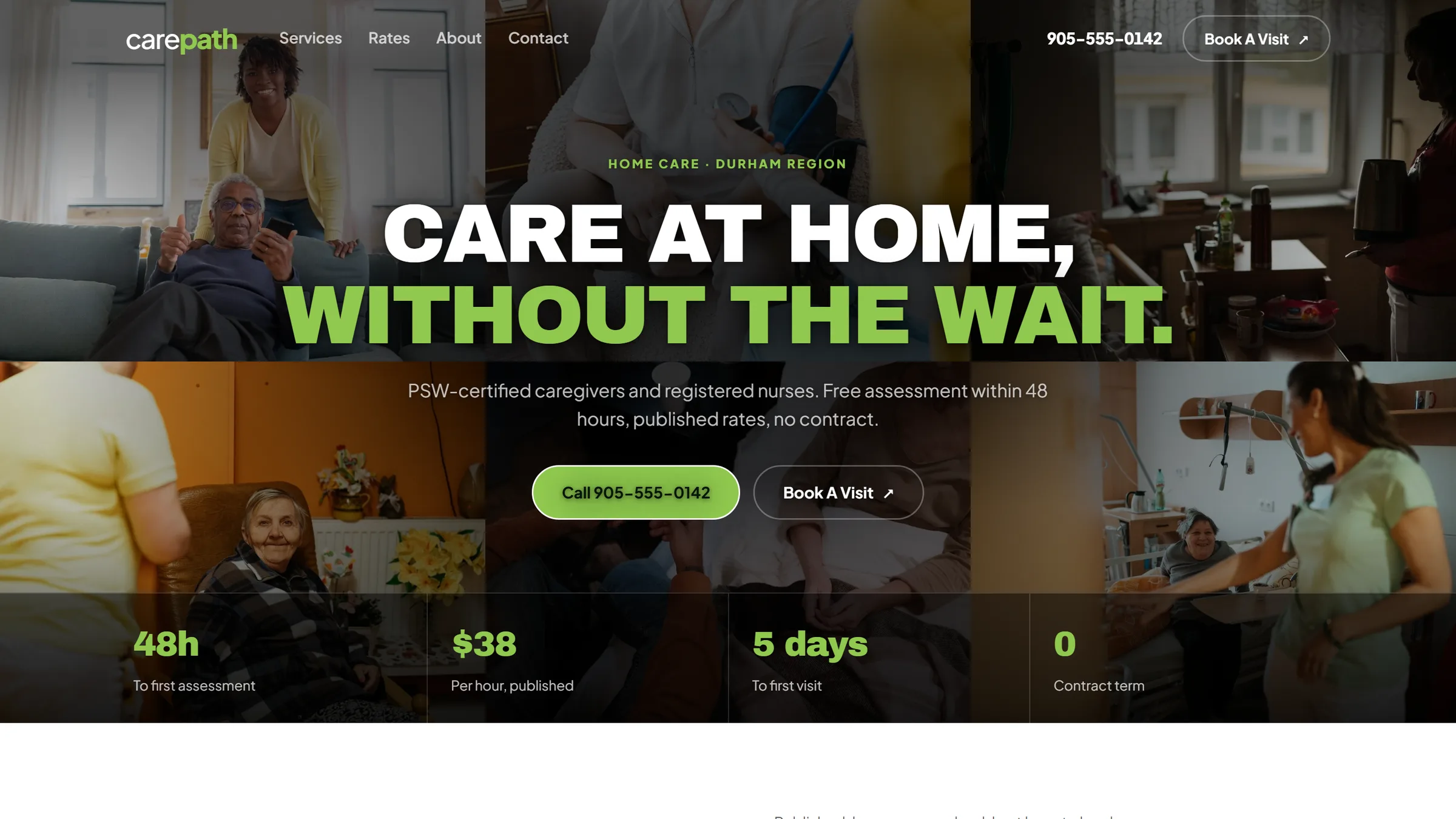
The qualifying numbers sit in the hero. Six photographs of care at home run behind the headline, and the strip along the foot of the first screen carries the four facts that decide whether a visitor should keep reading: 48 hours to an assessment, $38 an hour, five days to a first visit, no contract term. Most sites in the category make you book a call to learn any of it.
Rates are published. A full table — six services, hourly rates, visit minimums — sits on the homepage and again on its own page. It is the one piece of information that qualifies or disqualifies a visitor in seconds, and hiding it behind an assessment booking wastes everybody’s time.
Staffing is answered without being asked. A section titled “Who comes into your parent’s home” lists what is on file for every caregiver: PSW certification verified with the issuing college, an annually renewed Vulnerable Sector Check, WSIB coverage carried by the company rather than the family, RN supervision of the care plan.
The public system is named. The rates page tells the reader that Ontario funds home care hours at no cost through Ontario Health atHome, and advises applying for those first. A private provider saying so loses some revenue and buys the only thing that matters in this category, which is being believed.
Motion is almost absent. One settle on arrival, and nothing moves on scroll. Someone hunting for a phone number at 11pm should not have to wait for content to animate into place.
The loud treatment is rationed. The visual language here is borrowed from a contractor-financing brand — black ground, heavy condensed uppercase, a single acid-green accent — which is confident in a way this category rarely is. Carried the full length of the page it would read as funereal, so the black owns the hero and the close and the body sits on near-white using the same type and the same accent. The green also changes value between the two: the bright lime is legible on black and measures under 2:1 on white, so light grounds use a darker cut of the same hue that clears WCAG AA. On a site read by people in their seventies that is not a detail.
Limited project slots each month
Book a 30-minute review.
We look at your site together and tell you the first three things we would change. No pitch, no obligation.